Tag Archives: data visualization

A Little of This, A Little of That

30 Oct

I’ve been out and about and busy juggling many things this month – library conferences, speaking engagements, and day-to-day work. All of it finds me neglecting my poor blog. Let’s see if I can’t remedy that a bit today. Continuing with the theme I began with my last post, here are some great finds that I’ve come across over the past weeks:

Rob Peterson of Dun and Bradstreet offered a nice blog post last month, highlighting 14 Data Visualization Tools to Tell Better Stories with Numbers. It provides a concise overview of which type of visualization is best for the job, along with links to online tools for each. Remember, if you only have a hammer, everything looks like a nail. Keep more than one tool in your toolbox.

I’ve printed off the instructions for How to Make a Timeline from a Google Spreadsheet. They’ve been sitting on my desk for weeks, but I know I’ll find the time(line) to give it a try. Timelines can be such a wonderful way to tell a story.

Print Friendly was recommended to me via some blog and/or list that I follow. I’ve discovered that I use it so very often since. It’s terrific for printing out webpages without all of the ads and photos and whatnot. If you must print, it offers a greener way of doing so.

Thanks to the great folks at both UMass Amherst and UConn, plus the Boston Library Consortium, I was finally able to attend a hands-on workshop on Tableau. I tried unsuccessfully to teach myself how to use it for awhile. (This is due more to my lack of time and focus than on any of Tableau’s tutorials and help guides.) I knew that I’d like it, if I got around to using it. And yesterday, I published my first test visualizations. Woot!!

The American Society of Cell Biology recently shared an article about NIH’s new tool to calculate Relative Citation Ratio. iCite allows users to compare citations, offering an alternative (read, better) to the standard journal impact factor. It’s nice to see NIH supporting the idea that the measure(s) of research impact are broader than we’ve long accepted.

I’m a big fan of Shaun Usher and his projects, “Lists of Note,” “Letters of Note,” and “LetterHeady.” While perusing his site recently, I came across the collection of videos called, “Letters Live.” The art of letter writing is sadly fading, but its beauty thankfully revisited through this wonderful collection of actors reading the correspondence of the famous and infamous. Enjoy!

One of the library conferences that I attended this month was the annual meeting of the North Atlantic Health Sciences Libraries (NAHSL). I was on the planning committee for the conference and one thing that I decided, on a whim, to do was create NAHSL BINGO, a game that attendees could play throughout the meeting. It was filled with typical sightings and/or sayings one sees/hears during these events (knitters? cell phones going off? someone complaining about the room’s temperature?). To create the cards, I Googled “bingo card generator” and found a great one here. Bookmark it for fun and games emergencies.

At that same meeting, perhaps one of the biggest audience gasps came when the librarians from Yale University’s medical library unveiled their brand spanking new tool to help the poor soul tackling systematic reviews … the Yale MeSH Analyzer. Geeky librarian souls, rejoice in its awesomeness.

My Desk

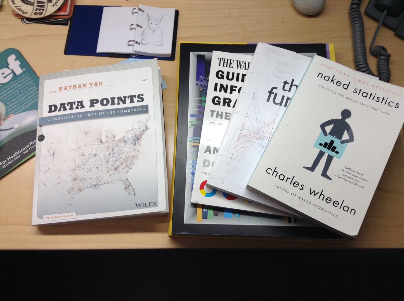
Lastly, this week’s What’s On My Desk Right Now? Nathan Yau’s, Data Points; Charles Wheelan’s, Naked Statistics; Albert Cairo’s, The Functional Art; Dona Wong’s, The Wall Street Journal Guide to Information Graphics; and the hot-off-the-press The Very Best American Infographics of 2015, edited by Gareth Cook. Oh, and a drawing of a bunny that I doodled while on a lengthy conference call a few weeks back. Sense a theme?

Until next time… doodle on!

Share and Share Alike

1 Oct

One of my favorite books from the past few years is Austin Kleon’s, Steal Like an ArtistI’ve mentioned it in several previous posts (search “Austin Kleon” on the site and you’ll find them), mostly because I continue to pop back to it on a regular basis. It’s filled with plain, simple, good thoughts to inspire your creative side. I also follow Austin on Twitter. Awhile back, he declared that he was going to shift from immediately tweeting out lots of ideas, project updates, and interesting things he came across online to putting them all in an indexed version that he’d send out via his Tumblr account on Fridays. Of course, as soon as I saw this announcement I signed up for his email list and ever since, his Friday email to me has become something that I look forward to.

My new role as an evaluator finds me doing a lot of things that I’m hard pressed to chronicle as I once did for my work in the library world. In part, I think it’s because I spend a great deal of time learning new things and/or putting newly learned skills into action. It takes time and energy that ultimately takes away from my abilities to come up with interesting musings for this blog. That said, I’m not about to give up my blogging habit. It means too much to me. After lots of thinking about how to revitalize it, the thought came to me to take Austin’s advice and steal an idea … from him!

Thus, I’ve decided to shift the pattern of own blog a bit – at least for awhile – and turn it into a way to share with you, my readers and followers, some of the cool and interesting and inspiring and, dare I hope, helpful things that I come across weekly in my work and play. So here we go … here are a few things from the past several weeks (I’m cheating already, but it’s the start of a new thing and thus allowed). Enjoy!

  1. It only seems fair that I give a tip of the hat to Mr. Kleon to start. Besides his books, I also enjoyed watching the video from a terrific talk that he gave to an audience at Google a few years ago. It’s a wonderful summary of his theory on stealing and some inspiring words to anyone seeking to get out of the way of themselves when it comes to creativity.
  2. Juice Analytics is a data analysis and design firm in Atlanta that provides visualization services to businesses and organizations. They also freely offer a number of great resources for learning these skills, including white papers, video tutorials, and the book, Data Fluency (not free, but well worth the $21.59 price tag for my Kindle version). One of the best resources on their freebie page is “30 Days to Data Storytelling,” a guide to … well, it’s pretty self-explanatory, isn’t it? It’s a list of videos, tutorials, articles, etc., a few a day for 30 days, to help you understand how to use data to tell your story. Good stuff.
  3. Back at the end of the summer, just as school was ready to gear up, Slate published a series of blog posts during one week under the banner, What Classes Should I Take? The list is fascinating and the posts very well written. Two that I liked in particular were, The Secret Technique for Learning How to Code: Step 1. Don’t Be Intimidated, by Victoria Fine, and What are the Odds: To Learn to Think Critically, Take a Statistics Class, by Laura Miller. These two are most relevant to anyone in the library, information, or evaluation worlds. I also found the advice to take Art History, Public Speaking, and No Class at All, quite valuable. The entire series was great.
  4. The Noun Project – Icons for Everything – is pure awesomeness. A gazillion free icons to drop and drag and plop into place OR inspire you to make your own.
  5. One thing that I do often in my job is doodle pictures to tell the story of a particular group of researchers or a research center. Fancy word, infographics. Since I started sharing some of these on this blog and other places, several colleagues and friends have asked for advice on tools to use to make them. I tend to draw my own in Illustrator and/or Powerpoint, but there’s a handy list of 10 Free Tools for Creating Infographics on the Creative Blog website.

Finally, I think I’d like to add one consistent thing for each of these lists/posts. I’m going to call it, What’s On My Desk Right Now. Right now, it’s this:

Visual Storytelling

Visual Storytelling: Inspiring a New Visual Language, edited by Klanten, Ehmann, & Schulze, and available through Gestalten. I learned about this book after stumbling upon an interview with Jonathan Corum, the graphics editor for science at the New York Times. He’s one of many featured in this book and I can’t wait to dive into it. Now. Lunchtime reading!

Learn Something New Every Day

27 Aug

My spouse recently got a call from a couple of faculty members in the computer science department at the college where she teaches. Lynn teaches in the art department; graphic design, motion design, typography, and the like. The computer science guys wanted to explore the possibility of her teaching a course in data visualization. Knowing that I have both an interest in the topic, plus the need to fumble through learning it (and using the new-found skills) for my job as an evaluator, she asked me what I thought about the opportunity.

Lynn knows enough about data visualization to know there’s a computer programming aspect to it. The computer science guys know enough to know there’s a design element to it. They all know that there’s math involved, specifically statistical analysis. I also suggested that it involves writing and/or journalism. She was hesitant – and rightly so – to jump on board without thinking and talking it through, because what she is an expert in is only one area of a multi-disciplinary field.

“It’s team science,” my boss, Nate, said when I shared the story with him. Exactly. And in many ways it’s an example of how the ways we traditionally teach, research, and work need to be re-examined and re-worked.

Too often, I find, we search for collaborators within our own circles of expertise. Librarians collaborate with other librarians. They might be from different types of libraries or different library departments, but often we’re all librarians. Researchers collaborate with other researchers. Scientists with other scientists. In some ways, it can be argued, this is team science (or team-based work), but it falls short of the ideal.

At it’s best, team science brings together experts from across different disciplines to work on problems that simply cannot be tackled by any one group. Think about a health problem like obesity. It’s huge and as such, touches upon so many different aspects of life. Addressing it requires everyone from geneticists to behavioral psychologists to nutritionists to exercise physiologists to public policy makers to urban planners to educators to medical doctors to parents to science writers to … it’s probably easier to identify the experts not needed than those who are. The point being that some of the most successful efforts at addressing obesity are those that bring as many of these fields of expertise together, to work together towards a solution. (The UMass Worcester Prevention Research Center is an example, close to home for me.)

But back to data visualization, what I’ve found is that those who do it best are either freakingly gifted (there’s always an Edward Tufte in any area) or they’re smart enough – and talented enough – to assemble good teams for the work. As I’m seeking to discover the best resources to learn and practice the skills for this job, I’m continually reminded to look across lots of different disciplines. I look to evaluators (Stephanie Green and Chris Lysy), graphic designers (Nigel Holmes), business intelligence consultants (Stephen Few), journalists and journalism professors (David McCandless and Alberto Cairo, respectively), artists (Manuel Lima), statisticians (Nathan Yau), doctors (Hans Rosling), and the people in my very own Quantitative Health Sciences Department. I read things by people who are good presenters, experts in visual communication, and those skilled in improvisation. In other words, while I’m limited in resources to actually form a real team of experts to do data visualization for the UMCCTS, I’ve learned enough to seek them out from across lots of corners so that I can do a better job. (I’m also lucky enough to be working in an environment where people don’t mind me trying things out on them. It’s a benefit of being in academia.)

Thanks to Chris Lysy’s (DiY Data Design) weekly creative challenge, this week I practiced using design icon arrays to report on the findings of a course evaluation with a small (n=15) class size. We get so hung up on “big data” that it’s easy to forget the real challenges of working with and presenting the results from small data sets. I really enjoyed taking this challenge and putting it to use. Here are a couple of examples. For the sake of privacy, I’ve redacted the questions being reported.

Time

Sample Arrays

Now, here’s one lesson that I learned for the next time that I use this visualization device. I need to make them like this:

better copy

This example allows me to better show that each response is represented by a single box, thus 11 people answered “Yes” and 4 answered “Somewhat.” Live and learn. Every day.

Next Tuesday, I’m taking a workshop on creating podcasts. It’s something that I’ve wanted to try and I found a 2-hour, evening class in Boston. Stay tuned to see what that new learning might bring.