I’ve noticed how ever since I became an evaluator, I’m much more in tune to numbers. This isn’t to say that I never paid any attention to numbers before, but now, when I hear stories on the radio or I read articles in my local newspaper, I look more closely at what’s being reported regarding those numbers. What’s really being said? And more, I find myself asking, “What do these numbers really represent?” Here’s an example:
This morning, I was listening to a story on NPR about the voter turnout in this week’s Iowa caucus. Specifically, the story was about the turnout among younger voters (17-29 years of age) in Iowa and what, if anything, this turnout says about this voting bloc nationally.
Aside: You can find interesting data regarding the Iowa electorate (as well as other states) on the U.S. Census Department’s website. You can find specifics regarding the turnout of younger Iowa voters on the website of CIRCLE (The Center for Information and Research on Civic Learning and Engagement).
But back to the NPR story… Renee Montagne interviewed Kei Kawashima-Ginsberg, director of the Center for Information and Research on Civic Learning and Engagement at Tufts University, about these millennial voters. Phrases like, “record numbers” make my ears perk up. “What was the record?” I wonder. “What are we talking about?” In brief, Kawashima-Ginsberg stated, “The youth turnout was 11.2%.”
“11.2% of what?” I ask out loud in my car, to no one.
“On the Republican side, Ted Cruz received 27% of the votes, Mark Rubio 24%, and Donald Trump 19%.”
Again I ask, “27% of what?” No one answers.
Bernie Sanders, I’m told, won 84% of the Democratic vote, compared to Hillary Clinton’s 14%.
“Wow! 84%. That’s a lot! You do keep reporting how he’s winning the hearts of young folks.”
I pull out the note pad that I keep in the dashboard cubbie of my car and write down, “Young voters 84%, 14% // 11% = x” I put the note in my pocket, determined to figure out what these numbers mean. Later, I did.
The total number of young people, defined here as voters between the ages of 17-29, that participated in the Iowa caucus was 53,215. What’s that look like? I need a visual reference. I think of this demographic and I think of college. It’s a natural reference-point for me, a college grad. When I think of college and crowds, I think football. (Plus, the SuperBowl is but a few days away. Think football.) Thus, to give myself the visual that I need, I decide to compare these numbers to the capacities of various college football stadiums. Here’s what I found…
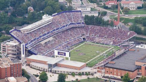
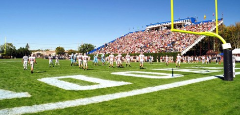
… 53, 215 people equals a sold-out crowd for a football game at Rutgers University’s High Point Solution Stadium.

High Point Solutions Stadium, Rutgers University, East Rutherford, NJ
Okay, that’s a good-sized crowd. Granted, it’s not quite half of the capacity of the University of Michigan’s stadium, but let’s remember, it’s Iowa, a state who’s population makes up .97% of the United States as a whole. Michigan is up there at 3.11%. (All of this data comes from Census.gov.)
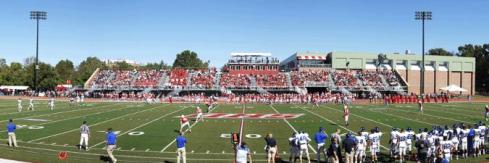
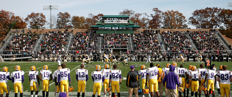
Of these 53,215 caucus-goers, 22,415 were Republicans and 30,800 were Democrats. Bernie Sanders won the support of 84% of those 30,800, or approximately 25,800 young people. I need a reference. What do 25,800 people look like? A sold-out crowd at my alma mater, James Madison University’s Bridgeforth Stadium. Go Dukes!
Bridgeforth Stadium, James Madison University, Harrisonburg, VA
Hillary Clinton’s 14%, or 4,312 youthful supporters from Tuesday night, could fit in at Sacred Heart University’s (Fairfield, CT) Campus Field.
Campus Field, Sacred Heart University, Fairfield, CT
Ted Cruz and his 27% of young Republicans (5,828) fill up the Butler Bowl of the Butler University’s Bulldogs in Indianapolis, IN.
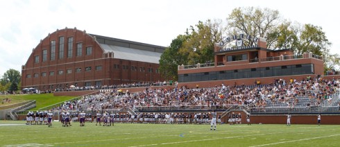
Butler Bowl, Butler University, Indianapolis, IN
Mark Rubio’s 5,155 (24%) supporters would fill the stands of the University of Rhode Island’s Rams Meade Stadium.
University of Rhode Island, Meade Stadium, Kingston, RI
And finally, Donald Trump’s 4,483 supporters, or 19% of the young Republican caucus-goers, would fit nicely in Bryant College’s (Rhode Island) Bulldog Stadium. Or perhaps, more apropos, they could stay approximately 3 to a room in the 1,250 “deluxe guest rooms and palatial suites” of the Trump Taj Mahal casino in Atlantic City.
Put into these contexts, the numbers make so much more sense to me. Sure, 25,800 people (that 84% Bernie came home with) is a lot of people, but in perspective, my alma mater isn’t exactly a gigantic school. It’s a good-sized school, mind you, but it’s hardly representative of the number of people who might vote in a general election, even if they could all agree on anything, in mass, besides cheering for the Dukes.
Additionally, these stories say an awful lot about how numbers and statistics get used in our reporting. “The American People,” a phrase that every single politician, pollster, and news junkie talking head over-uses means … what? A percentage of a percentage of a percentage of a percentage of people is generally a number way smaller than an image that “The American People” conjures up. It’s also, more than likely, a smaller sample size of ideas and beliefs, morals and behaviors, arguments and agreements, and problems and solutions than the 323,000,000 people in the United States hold in total.
Yes, the political season in America is just getting rolling and it’s a great time to pay attention to the numbers reported, seek out sites for trustworthy statistics, do some math yourself, and hone up on your data fluency skills. (That last bit is a nod to a terrific book, Data Fluency, from the smart folks at Juice Analytics. Check it out.)