Tag Archives: resources

3 Plus 1 Plus 1

13 Jan

So last week I claimed I was going to reset/restart my writing here with a format of 3 interesting things I discovered during the week, plus a question. I’ve always noticed that if/when I start looking for things, I inevitably find more. That’s what happened this week. I’ve got 5 – 5 fun and interesting things from the week to share. Here goes:

The Noun Project’s Free 2023 Marketing and Social Media Content Calendar

If you’re unfamiliar with the Noun Project, I highly recommend the site. Even more, if you afford it, I recommend an annual subscription (around $40). This gives you not only unlimited downloads of high quality icons and photos to use in presentations, handouts, social media posts, etc., but it also helps support the site and all of the graphic artists who contribute to it. The free calendar suggests icons and images throughout the year, relating to holidays and other observances. I’m one of the social media posters for my library and I’m always looking for ideas of things to post that coincide with whichever days I’m assigned. I’ve bookmarked the calendar site for future reference.

Massachusetts Center for the Book Tour Series, aka Book Trails

Break out your state map (or GPS) and plan some trips to visit places around Massachusetts related to literature. You can use the resource to plan visits to museums like the home of Louisa May Alcott (Concord) or the House of Seven Gables (Salem) or The Mount, Edith Wharton’s home in Lenox. You can also explore the deep and rich history of African American authors in the state, from the Underground Railroad site in New Bedford, where Frederick Douglass settled for awhile, to Malcom X’s Roxbury home, to the home site of W.E.B. DuBois in Great Barrington, as well as his residence on Flagg St in Cambridge. He lived in the latter while attending Harvard, as he was not permitted a dormitory space on campus. While this resource is targeted at sites in Massachusetts, check out your own state’s Center for the Book to see if they have something similar.

Journal Targeter (JOT)

Created by the Townsend Lab at Yale University’s School of Public Health, this is another tool to help authors find the most appropriate journals to submit manuscripts for publication. Users enter the title, abstract, and references for their paper into the service and it generates a list of matches to pursue. This isn’t an uncommon question in my library, so tools like this are always helpful to recommend.

The American Chemical Society’s Guide to Scholarly Communication

This resource from the ACS is filled with great information on scientific communication, scientific writing and publishing, peer review, data management, style conventions, graphics (many towards chemistry, of course), and an important chapter on inclusivity. This most recent chapter presents guidelines on writing and presenting related to age, disabilities and health conditions, gender and sexuality, diversity and inclusion, accessibility, socioeconomic status, and more. Another one I’ve bookmarked for easy reference in the future.

Cookie Monster’s Real Name is Sid

Not that you want to skip any of this, but if you scroll to the 7 minute mark, you’ll see!

A Question

What does anyone ever really get out of denying people the opportunity to read?
Learn Something New Every Day

27 Aug

My spouse recently got a call from a couple of faculty members in the computer science department at the college where she teaches. Lynn teaches in the art department; graphic design, motion design, typography, and the like. The computer science guys wanted to explore the possibility of her teaching a course in data visualization. Knowing that I have both an interest in the topic, plus the need to fumble through learning it (and using the new-found skills) for my job as an evaluator, she asked me what I thought about the opportunity.

Lynn knows enough about data visualization to know there’s a computer programming aspect to it. The computer science guys know enough to know there’s a design element to it. They all know that there’s math involved, specifically statistical analysis. I also suggested that it involves writing and/or journalism. She was hesitant – and rightly so – to jump on board without thinking and talking it through, because what she is an expert in is only one area of a multi-disciplinary field.

“It’s team science,” my boss, Nate, said when I shared the story with him. Exactly. And in many ways it’s an example of how the ways we traditionally teach, research, and work need to be re-examined and re-worked.

Too often, I find, we search for collaborators within our own circles of expertise. Librarians collaborate with other librarians. They might be from different types of libraries or different library departments, but often we’re all librarians. Researchers collaborate with other researchers. Scientists with other scientists. In some ways, it can be argued, this is team science (or team-based work), but it falls short of the ideal.

At it’s best, team science brings together experts from across different disciplines to work on problems that simply cannot be tackled by any one group. Think about a health problem like obesity. It’s huge and as such, touches upon so many different aspects of life. Addressing it requires everyone from geneticists to behavioral psychologists to nutritionists to exercise physiologists to public policy makers to urban planners to educators to medical doctors to parents to science writers to … it’s probably easier to identify the experts not needed than those who are. The point being that some of the most successful efforts at addressing obesity are those that bring as many of these fields of expertise together, to work together towards a solution. (The UMass Worcester Prevention Research Center is an example, close to home for me.)

But back to data visualization, what I’ve found is that those who do it best are either freakingly gifted (there’s always an Edward Tufte in any area) or they’re smart enough – and talented enough – to assemble good teams for the work. As I’m seeking to discover the best resources to learn and practice the skills for this job, I’m continually reminded to look across lots of different disciplines. I look to evaluators (Stephanie Green and Chris Lysy), graphic designers (Nigel Holmes), business intelligence consultants (Stephen Few), journalists and journalism professors (David McCandless and Alberto Cairo, respectively), artists (Manuel Lima), statisticians (Nathan Yau), doctors (Hans Rosling), and the people in my very own Quantitative Health Sciences Department. I read things by people who are good presenters, experts in visual communication, and those skilled in improvisation. In other words, while I’m limited in resources to actually form a real team of experts to do data visualization for the UMCCTS, I’ve learned enough to seek them out from across lots of corners so that I can do a better job. (I’m also lucky enough to be working in an environment where people don’t mind me trying things out on them. It’s a benefit of being in academia.)

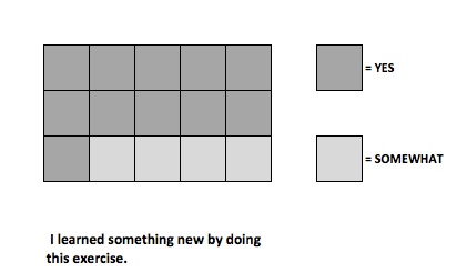
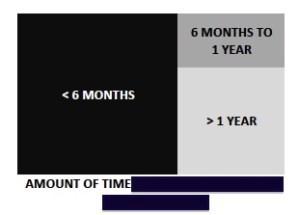
Thanks to Chris Lysy’s (DiY Data Design) weekly creative challenge, this week I practiced using design icon arrays to report on the findings of a course evaluation with a small (n=15) class size. We get so hung up on “big data” that it’s easy to forget the real challenges of working with and presenting the results from small data sets. I really enjoyed taking this challenge and putting it to use. Here are a couple of examples. For the sake of privacy, I’ve redacted the questions being reported.

Time

Sample Arrays

Now, here’s one lesson that I learned for the next time that I use this visualization device. I need to make them like this:

better copy

This example allows me to better show that each response is represented by a single box, thus 11 people answered “Yes” and 4 answered “Somewhat.” Live and learn. Every day.

Next Tuesday, I’m taking a workshop on creating podcasts. It’s something that I’ve wanted to try and I found a 2-hour, evening class in Boston. Stay tuned to see what that new learning might bring. 

Candy Canes 6, 7, and 8!

8 Dec

 December 6 – Share and Share Alike!

One of the best characteristics of our profession is sharing. Librarians share things freely and openly. Unfortunately, I’m as guilty as anyone in too often forgetting this fact. Libraries, library organizations, and the like are GREAT places to find archives of useful materials. One of these is the archives of webinars and resource materials from the Association of Southeastern Research Libraries. You’ll find lots of good things here related to data, the digital environment, emerging trends in research libraries, and more. 


 December 7 – “The future of libraries won’t be created by libraries.”

This is the opening line to a column, Let the Future Go, that David Weinberger, codirector of Harvard’s Library Innovation Lab and a senior researcher at Harvard’s Berkman Center for Internet & Society, wrote last September. I’ve written about Weinberger in past posts and really like the way he pushes us to think about information. It rubs some folks the wrong way (as this column did), but I personally like the challenges he presents. If you’re not afraid to think BIG when it comes to information and the role of libraries and other information services/institutions today, you might enjoy this piece. It will, at the very least, get you thinking.


December 8 – Datalibrarians Unite!

Datalibrarians, By Datalibrarians for Datalibrarians is a collaborative blog/website created by Celia Emmelhainz, the social sciences data librarian at Colby College in Maine. It offers up lots and lots of practical posts related to who datalibrarians are, what they do, tools they use, tips and tricks, and more. It’s a terrific resource for those working in and/or interested in this area of librarianship (which might be a bunch of people who follow my blog!). 🙂


Tune in tomorrow for more Candy Canes!