Tag Archives: infographics

Crossing the Radar Screen

5 Feb

radar-333574_960_720It’s Friday and it’s snowing here in Worcester – all of the makings of a quiet afternoon. I’ve spent the day mostly working through a book that I recently bought, Tableau Your Data! It’s a lot to take in, so I thought I’d take a break and clear out my “Weekly Blog Post Items” bookmark folder. Here are some fun and interesting finds that crossed my radar screen during the past week:

Determined to hone my data visualization chops, I’ve been on the lookout for interesting sources of data to use for practice. The U.S. Census Department’s website is a great spot, of course, but a special gem that I found hidden on it is Stats for Stories. Here, you’ll find statistics related to stories that are in the news, calendar events and/or holidays, and more.  

It’s 2+ hours long so I’ve hardly sat and watched the entire thing yet, but what I’ve seen of the keynote address by Christian Chabot and Chris Stolte on the “Art of Analytics” at Tableau Conference 2014 is quite fascinating. Data visualization as an art form – it’s a topic that draws me in.

Obsessive fans (who me?) of the TV show, Law & Order, along with its many iterations will find Cecilia Esther Rabess’ latest entry in her McSweeney’s column, Mostly Uninformative Infographics, hilarious and oh, so true. … About Law & Order: Special Victim’s Unit

My wife has been co-teaching Sunday school these past few months using a curriculum called, “D’oh, God!” It’s based around episodes of The Simpsons. Naturally, when I learned about Frinkiac, the database of 3 million+ screen captures from the show, I had to pass it along. Enjoy!

The Washington Post’s story, “What Ivy League Students are Reading That You Aren’t,” along with the data source for it, the Open Syllabus Explorer database, both fascinated me this week. 

If you’re curious about the source of words and phrases in the English language, you’ll likely find Arika Okrent’s YouTube channel awesome. Okrent is a contributor to the magazine, Mental Floss. I’ve subscribed to it for years, preparing myself for that “Jeopardy!” tryout that I just know I’m going to be invited to some day.

Virginia Woolf made famous the idea of “a room of one’s own.” I’m so very fortunate to have a studio space in an old factory mill in town where I can go and be creative in any and every fashion. It’s my space. My room of my own. Bored Panda’s “100 Famous Artists and Their Studios” is a wonderful photo trip through the rooms of some incredibly talented people. I found it inspiring.

Finally, the SuperBowl is this Sunday. I’m likely in the very small minority who tunes into the game to watch the game. I turn to a different channel during the half-time show and I mute all of the commercials. I realize that folks pay a gazillion bucks for these spots, but I always mute (or fast-forward through) commercials. Bleh! That said, these two spots made for Sunday’s game but released earlier got me. Dachshunds and singing sheep. What could be better?!  

and

Happy Friday, everyone!

A Picture CAN Tell a Dozen Tables’ Worth of Data

10 Dec

[The following was originally written for the UMCCTS December Newsletter.]

When it comes to summarizing and sharing information with an audience, one important thing to remember is the audience itself. It’s a pretty simple concept, yet too often forgotten or dismissed when we’re preparing a talk, an article, a policy statement, patient education materials, and the myriad of other containers into which we fit our message.

Most recently, I’ve been working to pull together sections for the Final Progress Report for our initial Clinical and Translational Science Award. This is not my first time writing such a report and as has been the case in the past, we follow a template that goes something like:

Overall Objectives and Goals > Aims > Accomplishments Associated with Each Aim > Milestones Reached for the Same > Challenges Faced > Future Plans

These reports are lengthy and dry, filled with lots of bullet points and tables and numbers. I’m not privy to how these reports are read at NIH, but I imagine that the format fits how they are reviewed and makes it easier for funders to see a bigger picture across similar awards. Funders and reviewers are the audience, thus we present our information to them in the way they’re accustomed – the way that they understand.

Taking a break from all of the writing, I decided to turn one of the bigger tables of information I’ve received into something for a different audience. Sarah Rulnick, MPH, Project Manager for the Conquering Diseases Project, recently compiled some information regarding the work of the Biorepository and Volunteer Database. These are both integral pieces in the UMCCTS efforts to support clinical trials. I read through the narrative portions of Sarah’s summary and took in the full-page table giving yearly counts of things such as the number of patients consented for the biorepository, MiCARD searches performed, outreach events organized, and the like.

I started to think about a way that I could summarize this information for both people who have already enrolled in the Volunteer Database and those who might potentially do so, if they only understood a bit more about the importance of participation. It’s an audience that Sarah and her colleagues are charged to reach. I pulled out the data points that I thought best addressed this goal. I also brainstormed what came to my mind when I thought about conquering something. What I ultimately came up with is this:

Conquering Diseases

Coincidentally, right in the middle of writing this newsletter piece, I watched a 20-minute “Coffee Break” webinar from the American Evaluation Association. I hadn’t connected the webinar with this piece, but they certainly appear to be related. The webinar was entitled, “How to Develop Visual Summaries and Inforgraphics from Your Evaluation Findings,” and presented by Elissa Schloesser, a graphic designer and visual communicator based in Minneapolis. She, too, talked about knowing your audience and she offered an excellent example of how she prepared two very different materials for two groups; both from the same report. I felt I was on track with my message here.

Elissa has some other nice examples on her My Visual Voice. If you’re thinking of communicating some of your work visually, they might inspire you.

Map it Out

1 Dec

I’m taking Alberto Cairo‘s 6-week online course, Introduction to Infographics and Data Visualization, taught through the Knight Center for Journalism in the Americas at the University of Texas at Austin. Just like every other MOOC that I’ve taken over the past few years, I can never keep up with the assignments and get in on the discussions as I wish, but I still appreciate all of the resources and lectures and insight that I get from them.

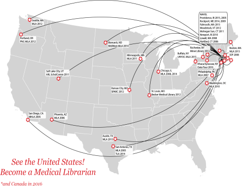
With info-doodling on my mind, I’ve been putting together a few new ones this week. (It’s a nice diversion from writing a lengthy, very dry final progress report for NIH.) Some are in draft form and I’m awaiting feedback from folks on their content, but here’s a quick and fun one that I put together during lunch. I was remembering all of the places that I’ve been over the past 10+ years related to my work as a medical librarian / informationist / evaluator. It’s been a good gig!

What do you think?

Travel Map