Ahhhhh… there’s nothing like a week of vacation to rejuvenate the soul. Now I’m back in the saddle and ready to empty out my “Fun Stuff to Share” bookmarks folder just for you. Here we go!
First off, you can jump on that crazy craze of “adult coloring” with these fun and informative (and free) downloads – the National Archives coloring book of weird patents and the Supreme Court Justice Ruth Bader Ginsberg coloring book that you didn’t know you needed. Both are guaranteed to give you hours of relaxing fun with crayons, markers, colored pencils, you name it. Go ahead! Indulge your creative side. (Personally, I’ve never stopped coloring, so I don’t quite get the craze, but…)
On a different note, I’ve been serving on a strategic task force for the Medical Library Association that’s looking at developing a research institute; a crash-course, if you will, on research methods and design. I’ve long been a proponent that research methods and statistics should be standard fare in library school curricula, but until that happens, MLA and other professional organizations are stepping up to fill this void in our collective professional knowledge. Working with this group has led me to gather many relevant resources, including this handy Basics of Experimental Design (A Quick and Non-Technical Guide). It’s a great overview on the topic.
My last blog post described how I incorporate alternative metrics into my work as an evaluator for a CTSA site. Stacy Konkiel, who works for Altmetric, wrote an interesting post recently that describes how she leads workshops on altmetrics. It contains a lot of good advice for those wishing to demonstrate to stakeholders the value of these metrics.
And while we’re on the subject, Altmetric, a leader in this field, is offering up a unique opportunity for an Annual Research Grant to anyone looking for financial support to help carry out a research project related to alternative metrics. You can find out more information here. If you have an interesting question that you’d like to explore, consider applying!
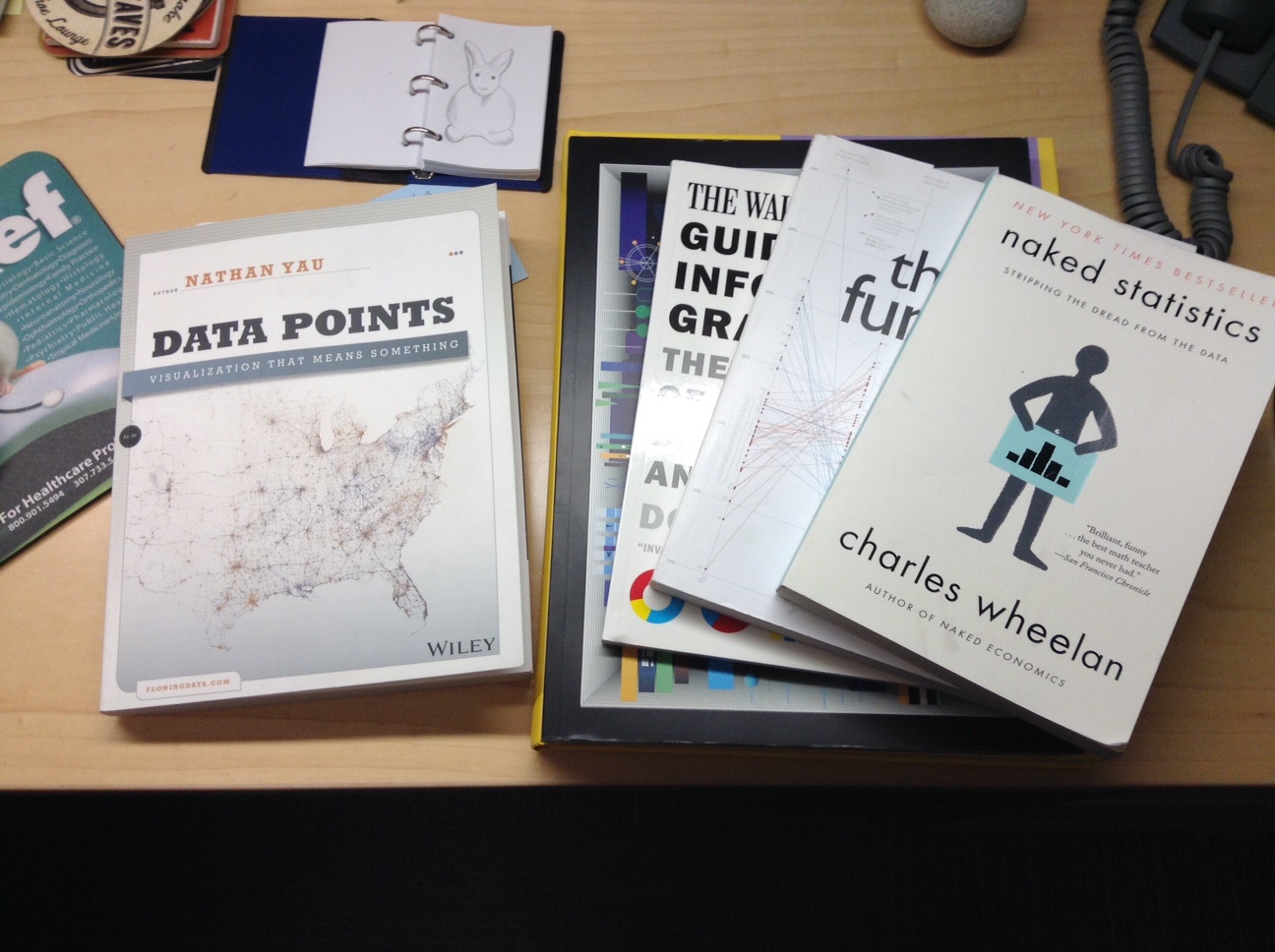
One of my invaluable resources for learning data visualization is Nathan Yau, his website Flowing Data, and his two books, Visualize This and Data Points. He’s one of the best instructors I’ve found for taking you step-by-step through design, visualization, and statistics. (The Flowing Data site has many great tutorials and guides.) He also produces scores of really interesting visuals like this one, Why People Visit the Emergency Room. Fair warning though, you can get lost on his site for hours. Plan accordingly.
A Short History of the Index Card is a fascinating read. From playing cards to the card catalog – enjoy!
Two helpful “how to” sites I came across; How to Turn Off Twitter’s New Timeline Feature (Ugh!) and How to Use Preview to Put Signatures on PDFs (Mac Users). Ah, the Interwebs can be so very helpful at times.
Do you ever find yourself looking for some nice background music for a presentation? If so, check out the Free Music Archive, an amazing collection of free, legal audio downloads from WFMU, the awesome independent radio station in New York.
For those of you who, like me, still use the United States Postal Service for mailing bills and correspondence to friends and family, you can show your love of literature by using (or in many cases, collecting) these stamps that feature some of the best to ever put words to paper. Readers (and letter writers) unite!
Open Culture (surely one of the absolute best things on the Internet) recently posted 3,900 pages of the artist, Paul Klee’s, notebooks and journals. Thanks to my friend and fellow librarian, Susan Yowell, for sharing the link with me. I loved perusing it.
If you like books and you like taking photos, what could be better than the artist, Kelli Anderson’s, book that’s a camera? This Book is a Camera is on my wish list – likely not an item that I’ll be able to wait for until next Christmas, either!
For all of my friends and readers who are also teachers, you might find the substantial group of teaching aids from the documentary makers, Point of View (POV), really useful for bringing cultural events to life. Film clips, lesson plans, and a lending library are all available from the PBS program.
Finally, two articles from The Atlantic that consumed my lunch hour yesterday, both about one of my favorite writers, Annie Dillard. The first (and recent – from their March 2016 issue), Why Annie Dillard Stopped Publishing New Material, is a critique of each of her major works over the years. After I shared it on my Facebook site, a friend from my seminary days sent me the link to a story from last year, The Thoreau of the Suburbs. The latter was … well, I’m still taking it all in. I can’t write much about it for fear of giving away spoilers. If you, like me and many of my seminary friends, were affected by Dillard’s Pulitzer Prize winning, Pilgrim at Tinker Creek, read this article. Or maybe don’t. It depends on whether or not you want to know more about the truth behind the story. Great read! Really! (Thanks, Kevin!)
That’s all for this week. As always, thanks for reading and I hope you find something of interest here, too. And if you haven’t had a vacation in awhile, consider it. Wonders for the spirit!