My spouse recently got a call from a couple of faculty members in the computer science department at the college where she teaches. Lynn teaches in the art department; graphic design, motion design, typography, and the like. The computer science guys wanted to explore the possibility of her teaching a course in data visualization. Knowing that I have both an interest in the topic, plus the need to fumble through learning it (and using the new-found skills) for my job as an evaluator, she asked me what I thought about the opportunity.
Lynn knows enough about data visualization to know there’s a computer programming aspect to it. The computer science guys know enough to know there’s a design element to it. They all know that there’s math involved, specifically statistical analysis. I also suggested that it involves writing and/or journalism. She was hesitant – and rightly so – to jump on board without thinking and talking it through, because what she is an expert in is only one area of a multi-disciplinary field.
“It’s team science,” my boss, Nate, said when I shared the story with him. Exactly. And in many ways it’s an example of how the ways we traditionally teach, research, and work need to be re-examined and re-worked.
Too often, I find, we search for collaborators within our own circles of expertise. Librarians collaborate with other librarians. They might be from different types of libraries or different library departments, but often we’re all librarians. Researchers collaborate with other researchers. Scientists with other scientists. In some ways, it can be argued, this is team science (or team-based work), but it falls short of the ideal.
At it’s best, team science brings together experts from across different disciplines to work on problems that simply cannot be tackled by any one group. Think about a health problem like obesity. It’s huge and as such, touches upon so many different aspects of life. Addressing it requires everyone from geneticists to behavioral psychologists to nutritionists to exercise physiologists to public policy makers to urban planners to educators to medical doctors to parents to science writers to … it’s probably easier to identify the experts not needed than those who are. The point being that some of the most successful efforts at addressing obesity are those that bring as many of these fields of expertise together, to work together towards a solution. (The UMass Worcester Prevention Research Center is an example, close to home for me.)
But back to data visualization, what I’ve found is that those who do it best are either freakingly gifted (there’s always an Edward Tufte in any area) or they’re smart enough – and talented enough – to assemble good teams for the work. As I’m seeking to discover the best resources to learn and practice the skills for this job, I’m continually reminded to look across lots of different disciplines. I look to evaluators (Stephanie Green and Chris Lysy), graphic designers (Nigel Holmes), business intelligence consultants (Stephen Few), journalists and journalism professors (David McCandless and Alberto Cairo, respectively), artists (Manuel Lima), statisticians (Nathan Yau), doctors (Hans Rosling), and the people in my very own Quantitative Health Sciences Department. I read things by people who are good presenters, experts in visual communication, and those skilled in improvisation. In other words, while I’m limited in resources to actually form a real team of experts to do data visualization for the UMCCTS, I’ve learned enough to seek them out from across lots of corners so that I can do a better job. (I’m also lucky enough to be working in an environment where people don’t mind me trying things out on them. It’s a benefit of being in academia.)
Thanks to Chris Lysy’s (DiY Data Design) weekly creative challenge, this week I practiced using design icon arrays to report on the findings of a course evaluation with a small (n=15) class size. We get so hung up on “big data” that it’s easy to forget the real challenges of working with and presenting the results from small data sets. I really enjoyed taking this challenge and putting it to use. Here are a couple of examples. For the sake of privacy, I’ve redacted the questions being reported.


Now, here’s one lesson that I learned for the next time that I use this visualization device. I need to make them like this:
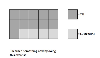
This example allows me to better show that each response is represented by a single box, thus 11 people answered “Yes” and 4 answered “Somewhat.” Live and learn. Every day.
Next Tuesday, I’m taking a workshop on creating podcasts. It’s something that I’ve wanted to try and I found a 2-hour, evening class in Boston. Stay tuned to see what that new learning might bring.
Tags: computer science, data visualization, design, resources, statistics, Team Science