(The following is from a spotlight talk that I gave at the annual meeting of the North Atlantic Health Sciences Libraries chapter of the Medical Library Association in New Haven, CT, October 25, 2016.)
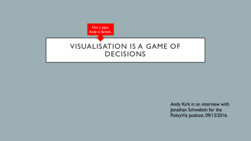 I was listening to economist and presentation expert, Jonathan Schwabish’s, PolicyViz Podcast last week. It was an episode from about a month ago; an interview with Andy Kirk, a data visualization specialist and the person behind the terrific website, Visualising Data. Andy is also the author of the new book, Visualizing Data: A Handbook for Data Driven Design, a must-have reference text for anyone seeking to produce effective visualizations. When asked why he wrote the book and the essence behind it, he replied,
Visualization is a game of decisions and to make good decisions you need to be aware of all of the options that you’ve got and then be aware of the influencing factors that shape what choices you can make. What skills have you got? How does that restrict or open up opportunities around chart types or interactivity? What are the formats that you happen to aspire towards and what does that impact in terms of the choices that you have to make for a given context?
I so appreciated this statement for a couple of reasons. First, looking at the act of creating visualizations as a decision-making process gets to the heart of why and how visuals either work or they don’t. In other words, good decision-making is key to good visuals, regardless of all the know-how one might have in terms of tools and/or design. You need to start and end with good decisions. Secondly, you need to have some skills and the more you develop your skills, the greater number of choices you’ll have available to you in the decision-making process. “Aspire.” It’s a grand word.
 My story of creating visuals started on a Friday afternoon when I was staring at a spreadsheet/report that I’m frequently asked for in my work. It’s a tracking form of our clinical research scholars, telling the number of grants they’ve applied for, the number and percentage of said applications are funded, the amount of money associated with each, the number of publications they’ve written, and other such metrics that tell the UMCCTS their return on investment, if you will, for these researchers.
 As I was looking at it – and as it was a Friday afternoon and I was needing something fun to do to finish my work week – I wondered if I could draw a picture that told the same story that the numbers and information in this spreadsheet told. I like to draw, so I thought I’d give it a go. I wasn’t sure that my bosses would like it, but I figured it didn’t hurt to try.
So I did just that and ended up with this: Surprisingly, my bosses loved it! And I was quickly asked to make some more, so I did.
 I made one to show how all five UMass campuses are involved with the UMCCTS. I made one highlighting the team science and/or collaborative nature of our sponsored programs. I made one showing the outcomes of our pilot awards, one illustrating the work of the Center for Microbiome Research, and one highlighting the peaks achieved by our Conquering Diseases Program. I covered my office door with them, put them in our monthly newsletter, and eventually we made a page on our Center’s website so that they live online.
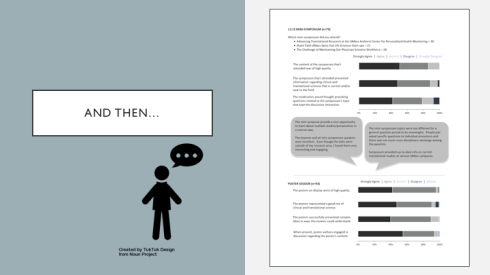 Next, we had our annual research retreat and when it came time for me to produce and give a report on the evaluations from the day, I decided to expand my chart-making skills, and learned how to make stacked horizontal bar charts to present the information more clearly and concisely. (Thank you, Cole Nussbaumer Knaflic.)
 Of course, the more charts I made, the more folks came to me with requests to make more. Each was an opportunity to learn something new, to try something different, to make choices and decisions – some good, some bad, some better. I made slides for a presentation that our Quality Assurance leader was giving to a group of clinical research administrators.
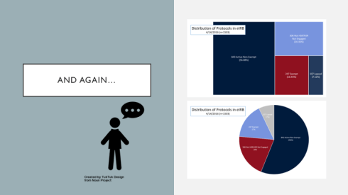 I made a tree map for the director of our Institutional Review Board. When I showed it to her she asked, “Where’s the pie?” So I made her a pie and she said, “You know, I like the tree better.” Yay! So did I.
 I also made her a 100% stacked bar chart to show average IRB approval times and in doing so, also finally made a color template of our UMCCTS colors. (Thank you, Stephanie Evergreen.)
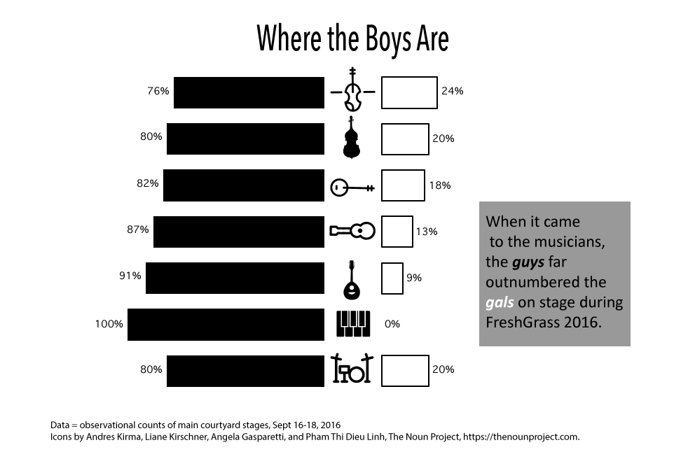
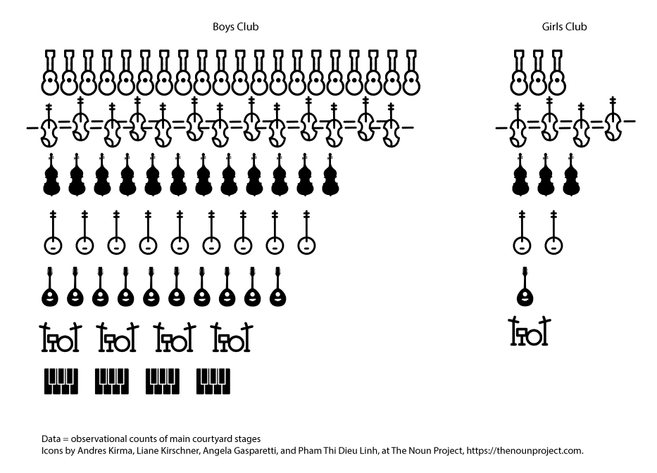
 And then, taking Andy’s words to heart (before I even knew them) I read and learned and practiced and expanded my skill set, learning dot plots, split bar graphs, lollipop graphs, embedding labels, and creating both heat maps and bar graphs in R. (Thank you, Nathan Yau.) It’s fun and it’s appreciated and it’s become a big part of my job now.
 And so when people continue to ask me why I’m no longer a librarian or what an evaluator does, I reply, that I AM a librarian. I’m a librarian who does evaluation and now that I’ve added the drawing pictures aspect to my toolkit, my wife calls me an INFORMATION ARTIST! It’s the best job title that I’ve ever had, by far.
What I hope everyone takes away from this talk – or this post – is that when it comes to being an information professional, the sky is the limit for all that you can do. Find what you like, find what you do well, find what you want to do, learn what you want to learn, and grow with the profession. It makes for a great career.