With my favorite Aussie, Janene Batten, medical librarian extraordinaire at Yale Medical School and Yale School of Nursing.
(This was originally posted on NAHSL Blog, the official blog of the North Atlantic Health Sciences Libraries, Inc. It’s reposted here with my own permission. Heh!)
One of my favorite singer-songwriters, Rosanne Cash, has a song titled, “Rules of Travel.” It’s completely unrelated to the content of this blog post, but it’s a great lead-in and/or title for it. I also realize that I’m not completely following the rules of NAHSL Professional Development Award blog posts, but please stick with me. It’ll make sense…
I have the great fortune to be on some short list for speakers for library conferences. I receive several invitations each year to travel to state or regional meetings, or library school classes, to talk about what I do for a living. I like to think that it’s because I do interesting things, that I’ve knitted together an interesting career path (not that I knit, but enough librarians do to get the metaphor). Enough folks have told me that they’ve read my blog for years and I know that this gets me invites. And I also like to think that I’m somewhat entertaining. At least to some people.
Anyhoooo… when I receive such invitations, I have some rules of travel that I try my best to apply. One of these is that if the content of the conference is of the slightest interest and/or relevance to my work – good odds, since these are library/information professional conferences – I ask that I receive free registration to attend the whole meeting. I don’t ask for much, if anything, to speak, so I figure it’s a good deal for both me and the group doing the inviting. I always learn things and I get to meet so many wonderful colleagues from all over the place.
The week before NAHSL’s annual meeting this year, I traveled to Detroit to give a keynote at the Michigan Health Sciences Library Association. The opening speaker for the meeting was Thomas Buchmueller, PhD, a health economist and professor at the University of Michigan. He teaches and does research within the School of Public Health there, focusing on “the economics of health insurance and related public policy issues.” (MHSLA program bio) In his talk, “Insured by Obamacare: Early Evidence of the Coverage Effects of the Affordable Care Act,” Dr. Buchmueller described the private coverage provisions of the ACA as a 3-legged stool. One leg represents underwriting reforms, an aspect the overwhelming majority of Americans support. The second is the individual mandate, the leg that has caused no end of trouble for the law, particularly given that the third leg, premium tax credits, haven’t kept up. The second and third legs are dependent upon one another for success.
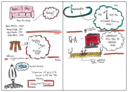
For me, Dr. Buchmueller’s talk was a terrific lead-up to the first plenary speaker at NAHSL 2016, Jack Hughes, MD, from the Yale School of Medicine. Dr. Hughes also took on the topic of health care / health insurance / the ACA in his talk. His description of the problem as “the iron triangle” fit so well with the 3-legged stool metaphor. The 3 sides of the Triangle – Cost, Access, and Quality – are all connected and addressing one aspect cannot and does not occur without effecting the others. The statistics presented in both of these talks are, in my opinion, both hopeful and shameful. Early evidence shows that the ACA has positively affected the numbers of Americans who are insured and who seek preventive health care both earlier and more often, thus reducing many expensive illnesses / procedures down the line. But at the same time, the issue of unbridled cost remains one that must be addressed before we will ever see and/or experience effective change in our health care system. Quality suffers, people suffer, and the American health system thus lags woefully behind those found in countries comparable to us in wealth and development.
I so appreciated hearing these two talks within a short period of time. I learned a great deal. I also really enjoyed following the back-channel, Twitter discussion on #NAHSL2016 that took place during Dr. Hughes’ talk. The questions of what defines American society, the beliefs the country was founded upon, the underlying sense of independence, our holding this up as the ideal of who we are as a nation/people… all of these came up in a GREAT discussion on how this ideal will or even can be reconciled with the ideas related to “health care for all.” I loved it! I love the passionate thoughts and knowledge-based opinions of my colleagues. It’s such a great characteristic of our profession. (As an aside, I also loved how Dr. Hughes’ tapped into this very thing with his polling exercises throughout his talk!)
I want to thank the NAHSL Professional Development Committee for awarding me a scholarship to help offset my expenses to travel to the conference this year. I also want to thank former NAHSL Chair, good friend, and tutor of all things Australian, Janene Batten, for letting me stay at her home during the meeting. Like so many of us, travel funds have been frozen at my institution, and the assistance of scholarships and the kindness of friends makes attending these wonderful events possible. This and a few rules of travel.
And lastly, thanks to the Program Committee for an outstanding meeting. Kudos on a job so very well done.
 My story of creating visuals started on a Friday afternoon when I was staring at a spreadsheet/report that I’m frequently asked for in my work. It’s a tracking form of our clinical research scholars, telling the number of grants they’ve applied for, the number and percentage of said applications are funded, the amount of money associated with each, the number of publications they’ve written, and other such metrics that tell the UMCCTS their return on investment, if you will, for these researchers.
  As I was looking at it – and as it was a Friday afternoon and I was needing something fun to do to finish my work week – I wondered if I could draw a picture that told the same story that the numbers and information in this spreadsheet told. I like to draw, so I thought I’d give it a go. I wasn’t sure that my bosses would like it, but I figured it didn’t hurt to try.
 Surprisingly, my bosses loved it! And I was quickly asked to make some more, so I did.
  I made one to show how all five UMass campuses are involved with the UMCCTS. I made one highlighting the team science and/or collaborative nature of our sponsored programs. I made one showing the outcomes of our pilot awards, one illustrating the work of the Center for Microbiome Research, and one highlighting the peaks achieved by our Conquering Diseases Program. I covered my office door with them, put them in our monthly newsletter, and eventually we made
 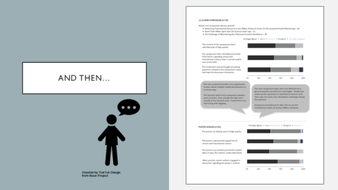 Next, we had our annual research retreat and when it came time for me to produce and give a report on the evaluations from the day, I decided to expand my chart-making skills, and learned how to make stacked horizontal bar charts to present the information more clearly and concisely. (Thank you,
  Of course, the more charts I made, the more folks came to me with requests to make more. Each was an opportunity to learn something new, to try something different, to make choices and decisions – some good, some bad, some better. I made slides for a presentation that our Quality Assurance leader was giving to a group of clinical research administrators.
 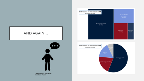 I made a tree map for the director of our Institutional Review Board. When I showed it to her she asked, “Where’s the pie?” So I made her a pie and she said, “You know, I like the tree better.” Yay! So did I.
 I also made her a 100% stacked bar chart to show average IRB approval times and in doing so, also finally made a color template of our UMCCTS colors. (Thank you,
  And then, taking Andy’s words to heart (before I even knew them) I read and learned and practiced and expanded my skill set, learning dot plots, split bar graphs, lollipop graphs, embedding labels, and creating both heat maps and bar graphs in R. (Thank you,
  And so when people continue to ask me why I’m no longer a librarian or what an evaluator does, I reply, that I AM a librarian. I’m a librarian who does evaluation and now that I’ve added the drawing pictures aspect to my toolkit, my wife calls me an INFORMATION ARTIST! It’s the best job title that I’ve ever had, by far.