Rosanne Cash … always wonderful!
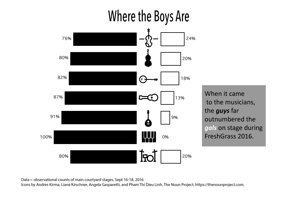
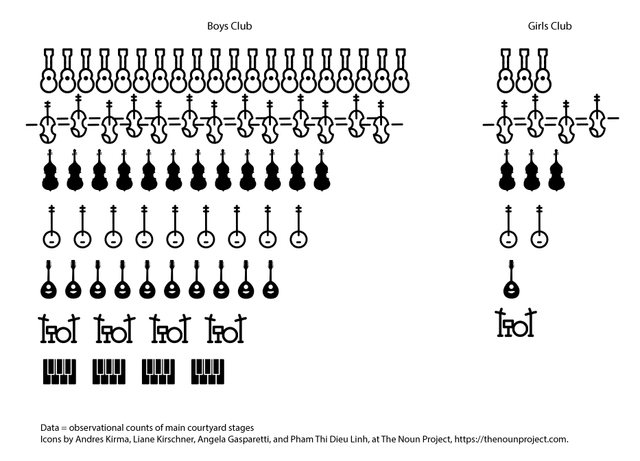
I attended the wonderful 3-day music festival, FreshGrass, last weekend. I saw a plethora of talent and a whole host of favorite musicians including Rosanne Cash, Glen Hansard, Aoife O’Donovan, Sierra Hull, Ruthie Foster, Alison Brown … but WAIT! By this account, one might think that the festival was dominated by women, but alas, it was far from a reconceived Lilith Fair. No, no. FreshGrass is a bluegrass / roots / Americana music festival and bluegrass / roots / Americana music is dominated by dudes.
Rather than letting my feminist self get all riled up over the gender gap and put a damper on my fun (because when I get angry I tend to have less fun), I decided instead to make a little data collection and data visualization project out of the experience. That’s fun.
You can see the total percentage of players, by instrument, in the first graphic. In the second one, each instrument represents one musician. I didn’t count all of the smaller groups on the courtyard stage and the pop-up performers (there were just too many to keep up with), but from casual observation, doing so wouldn’t have changed the results.
What’s all this to say? Probably plenty, but I’m simply going to take it as motivation to keep practicing so that I can do my part to close the gap.

Love this post – it makes me want to count things!
Thanks, Dina. I bet you’ll love this book http://www.dear-data.com.
Those have to be the most entertaining data visualization charts I’ve ever seen!
1. Is the third instrument down in Fig. 2 a viola or a bass?
2. Either way, I’m kind of surprised there were more of those than banjos.
3. One of your articles was used as an example in the MLA webinar class on statistics today – yay, you!
Hey Maureen, Yes, it’s a bass. It’s all about the bass… (Sing it). 🙂