Archive | Skills RSS feed for this section

How I Spent My Summer Vacation (Pt.1)

12 Jul

Well, truth be told, I’ve not had a summer vacation just yet. Still, things do seem to slow down a little bit at work during the summer months and I’ve taken advantage of the time to learn a few new things that will hopefully make me better in my job. I thought I’d share some of them, along with resources in case you wish to add some arrows to your quiver, too.

One of the biggest challenges that I face as an evaluator is being able to quickly (and often on the fly) answer questions about the different programs and projects of the UMCCTS. I struggle with rarely getting the same question twice – or at least my ability, yet, to hear the same question twice – and too often find myself scrambling to gather data from different sources, analyze it, and present it back to a particular stakeholder “by the end of the day.” Granted, I was certainly used to giving quick answers to questions from patrons when I worked in the library, but I had a couple of advantages there; (1) I’d worked for a number of years as a medical librarian, so I was pretty up to speed on the library’s resources and (2) the library was a nice, neat, set container of resources as opposed to any number of individuals and project leads and program directors and data gatherers spread across the campus. Praise be the library! It’s difficult to overstate the value of organization. But I digress…

My challenge now is to make my own library, to build my own collection of resources, and to keep them current so that those stressful “by the end of the day” requests are less so. Enter spreadsheets, pivot tables, and dashboards. I was hardly a novice Excel user when I started this work, but enough reading in the literature and best practices of evaluation led me to believe that I needed to expand my know-how about Excel in order to make things easier for myself. After my last scramble to fulfill a “just in time” request, I decided to get to it. I read two excellent books on data visualization that base most of their material on examples from Excel; Cole Nussbaumer Knaflic’s, Storytelling with Data, and Stephanie Evergreen’s, Effective Data Visualization. These are both great, hands-on books to get you going. I also came across Excel Campus, with one of the best series of video tutorials I’ve ever viewed. The 3-part series on building pivot tables and dashboards was just what I needed.

With these new skills, I’m able to take lengthy, unwieldy (to me) spreadsheets and turn them into several separate sheets with associated pivot tables for analysis and interactive dashboards that let me quickly see the who, what, when, and where of our different programs. It’s a work in progress, but I can tell already that it will be helpful for me and – hopefully – when I develop more tables based upon the questions of the Center’s staff, it will be helpful for them, too.

Next up, I wanted to learn how to create both an overlapping bar chart and a heat map. I was inspired to learn the former from a blog post that I read, coupled with the task I had of writing a report summarizing the evaluation results of our annual research retreat. You know, when you create a survey to evaluate an event (a class, a retreat, a workshop, etc.), you’re often stuck with a whole bunch of questions producing a whole bunch of bar graphs showing how much people appreciated this, that, or the other thing about the event. My survey for the retreat was no different, but I knew that there had to be a better way to present the findings – “better,” meaning a one-page document. Overlapping bar charts seemed perfect. As you can see, I was able to use this type of chart to combine the results of several questions into one visual, making things a lot easier to read and a lot shorter in format.

Feedback

Five charts become one with an overlapping/stacked bar chart.

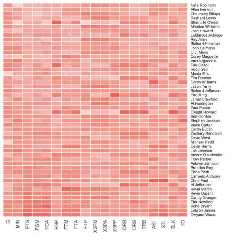
Now the heat map. Why? Oh, I don’t know. It was last Friday and a quiet day. And they’re kind of cool looking, so … back to tackling R for analysis and visualizations. (My goal here is to be able to be comfortable with these tasks in Excel, R, and Tableau, thus I switch off between them, to hone some skills.) I’ve mentioned here before that I find Nathan Yau’s books and website, Flowing Data, to be essential to understanding and doing data visualization. To learn (better said, “follow the instructions”) to make a heat map, I used the example that he offers in his book, Visualize This, but he also makes this particular exercise available in his collection of online tutorials, so you can have at it, too, if you wish. As you can see, I did indeed follow the instructions and made a nice little heat map of NBA players’ stats.

NBA Heatmap
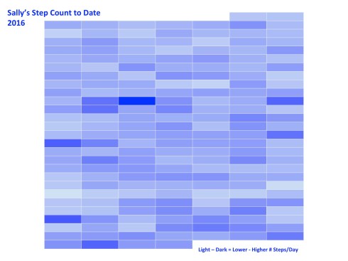
I also wanted to try making a heat map in Excel (easier said than done, though you can find resources online). I downloaded the data from my Jawbone fitness band that I’ve been wearing since December and made a nice map of my daily step count. Nothing fancy, but it worked just fine as a learning exercise.

Step Count Heat Map

I still plan to tackle making heat maps in Tableau, as well as other dashboards and charts that will be useful. The tool kit is never full and the summer isn’t even half over yet.

Enjoy! 

Show Me the Numbers

3 Feb

I’ve noticed how ever since I became an evaluator, I’m much more in tune to numbers. This isn’t to say that I never paid any attention to numbers before, but now, when I hear stories on the radio or I read articles in my local newspaper, I look more closely at what’s being reported regarding those numbers. What’s really being said? And more, I find myself asking, “What do these numbers really represent?” Here’s an example:

This morning, I was listening to a story on NPR about the voter turnout in this week’s Iowa caucus. Specifically, the story was about the turnout among younger voters (17-29 years of age) in Iowa and what, if anything, this turnout says about this voting bloc nationally.

Aside: You can find interesting data regarding the Iowa electorate (as well as other states) on the U.S. Census Department’s website. You can find specifics regarding the turnout of younger Iowa voters on the website of CIRCLE (The Center for Information and Research on Civic Learning and Engagement).

But back to the NPR story… Renee Montagne interviewed Kei Kawashima-Ginsberg, director of the Center for Information and Research on Civic Learning and Engagement at Tufts University, about these millennial voters. Phrases like, “record numbers” make my ears perk up. “What was the record?” I wonder. “What are we talking about?” In brief, Kawashima-Ginsberg stated, “The youth turnout was 11.2%.”

“11.2% of what?” I ask out loud in my car, to no one.

“On the Republican side, Ted Cruz received 27% of the votes, Mark Rubio 24%, and Donald Trump 19%.”

Again I ask, “27% of what?” No one answers.

Bernie Sanders, I’m told, won 84% of the Democratic vote, compared to Hillary Clinton’s 14%.

“Wow! 84%. That’s a lot! You do keep reporting how he’s winning the hearts of young folks.”

I pull out the note pad that I keep in the dashboard cubbie of my car and write down, “Young voters 84%, 14% // 11% = x” I put the note in my pocket, determined to figure out what these numbers mean. Later, I did.

The total number of young people, defined here as voters between the ages of 17-29, that participated in the Iowa caucus was 53,215. What’s that look like? I need a visual reference. I think of this demographic and I think of college. It’s a natural reference-point for me, a college grad. When I think of college and crowds, I think football. (Plus, the SuperBowl is but a few days away. Think football.) Thus, to give myself the visual that I need, I decide to compare these numbers to the capacities of various college football stadiums. Here’s what I found…

… 53, 215 people equals a sold-out crowd for a football game at Rutgers University’s High Point Solution Stadium.

RUFootballStadium

High Point Solutions Stadium, Rutgers University, East Rutherford, NJ

Okay, that’s a good-sized crowd. Granted, it’s not quite half of the capacity of the University of Michigan’s stadium, but let’s remember, it’s Iowa, a state who’s population makes up .97% of the United States as a whole. Michigan is up there at 3.11%. (All of this data comes from Census.gov.)

Of these 53,215 caucus-goers, 22,415 were Republicans and 30,800 were Democrats. Bernie Sanders won the support of 84% of those 30,800, or approximately 25,800 young people. I need a reference. What do 25,800 people look like? A sold-out crowd at my alma mater, James Madison University’s Bridgeforth Stadium. Go Dukes!

Bridgeforth Stadium

Bridgeforth Stadium, James Madison University, Harrisonburg, VA

Hillary Clinton’s 14%, or 4,312 youthful supporters from Tuesday night, could fit in at Sacred Heart University’s (Fairfield, CT) Campus Field.

Campus Field

Campus Field, Sacred Heart University, Fairfield, CT

Ted Cruz and his 27% of young Republicans (5,828) fill up the Butler Bowl of the Butler University’s Bulldogs in Indianapolis, IN.

Butler Bowl

Butler Bowl, Butler University, Indianapolis, IN

Mark Rubio’s 5,155 (24%) supporters would fill the stands of the University of Rhode Island’s Rams Meade Stadium.

Meade Stadium

University of Rhode Island, Meade Stadium, Kingston, RI

And finally, Donald Trump’s 4,483 supporters, or 19% of the young Republican caucus-goers, would fit nicely in Bryant College’s (Rhode Island) Bulldog Stadium. Or perhaps, more apropos, they could stay approximately 3 to a room in the 1,250 “deluxe guest rooms and palatial suites” of the Trump Taj Mahal casino in Atlantic City.

Bulldog Stadium

Put into these contexts, the numbers make so much more sense to me. Sure, 25,800 people (that 84% Bernie came home with) is a lot of people, but in perspective, my alma mater isn’t exactly a gigantic school. It’s a good-sized school, mind you, but it’s hardly representative of the number of people who might vote in a general election, even if they could all agree on anything, in mass, besides cheering for the Dukes.

Additionally, these stories say an awful lot about how numbers and statistics get used in our reporting. “The American People,” a phrase that every single politician, pollster, and news junkie talking head over-uses means … what A percentage of a percentage of a percentage of a percentage of people is generally a number way smaller than an image that “The American People” conjures up. It’s also, more than likely, a smaller sample size of ideas and beliefs, morals and behaviors, arguments and agreements, and problems and solutions than the 323,000,000 people in the United States hold in total. 

Yes, the political season in America is just getting rolling and it’s a great time to pay attention to the numbers reported, seek out sites for trustworthy statistics, do some math yourself, and hone up on your data fluency skills. (That last bit is a nod to a terrific book, Data Fluency, from the smart folks at Juice Analytics. Check it out.)


A Picture CAN Tell a Dozen Tables’ Worth of Data

10 Dec

[The following was originally written for the UMCCTS December Newsletter.]

When it comes to summarizing and sharing information with an audience, one important thing to remember is the audience itself. It’s a pretty simple concept, yet too often forgotten or dismissed when we’re preparing a talk, an article, a policy statement, patient education materials, and the myriad of other containers into which we fit our message.

Most recently, I’ve been working to pull together sections for the Final Progress Report for our initial Clinical and Translational Science Award. This is not my first time writing such a report and as has been the case in the past, we follow a template that goes something like:

Overall Objectives and Goals > Aims > Accomplishments Associated with Each Aim > Milestones Reached for the Same > Challenges Faced > Future Plans

These reports are lengthy and dry, filled with lots of bullet points and tables and numbers. I’m not privy to how these reports are read at NIH, but I imagine that the format fits how they are reviewed and makes it easier for funders to see a bigger picture across similar awards. Funders and reviewers are the audience, thus we present our information to them in the way they’re accustomed – the way that they understand.

Taking a break from all of the writing, I decided to turn one of the bigger tables of information I’ve received into something for a different audience. Sarah Rulnick, MPH, Project Manager for the Conquering Diseases Project, recently compiled some information regarding the work of the Biorepository and Volunteer Database. These are both integral pieces in the UMCCTS efforts to support clinical trials. I read through the narrative portions of Sarah’s summary and took in the full-page table giving yearly counts of things such as the number of patients consented for the biorepository, MiCARD searches performed, outreach events organized, and the like.

I started to think about a way that I could summarize this information for both people who have already enrolled in the Volunteer Database and those who might potentially do so, if they only understood a bit more about the importance of participation. It’s an audience that Sarah and her colleagues are charged to reach. I pulled out the data points that I thought best addressed this goal. I also brainstormed what came to my mind when I thought about conquering something. What I ultimately came up with is this:

Conquering Diseases

Coincidentally, right in the middle of writing this newsletter piece, I watched a 20-minute “Coffee Break” webinar from the American Evaluation Association. I hadn’t connected the webinar with this piece, but they certainly appear to be related. The webinar was entitled, “How to Develop Visual Summaries and Inforgraphics from Your Evaluation Findings,” and presented by Elissa Schloesser, a graphic designer and visual communicator based in Minneapolis. She, too, talked about knowing your audience and she offered an excellent example of how she prepared two very different materials for two groups; both from the same report. I felt I was on track with my message here.

Elissa has some other nice examples on her My Visual Voice. If you’re thinking of communicating some of your work visually, they might inspire you.