I have a folder on my favorites bar called, “Weekly Blog Post Items” into which I toss bookmarks for sites that I find interesting, helpful, or just fun – things that I think readers of my blog might enjoy, too. As I tossed yet one more URL in it this morning, I realized that it was overflowing. Ah, but ’tis the season for giving and so I give to you, my readers, the gift of a whole bunch of stuff to peruse. Let’s unpack the stocking, shall we?
14 Data Visualization Tools to Tell Better Stories with Numbers is a really nice article by marketing executive, Rob Peterson, posted on the website {grow}. Mapping, timelines, infographics and more are covered, along with links to popular tools to create each. One that I particularly liked is Timeline JS3. I’ve played with it a little bit and it’s pretty cool.
I may have mentioned Print Friendly before, but I love it so much, it’s certainly worth shouting out again. You can either use the website or download the browser button to quickly and easily print only what you want from a website. Don’t want to waste space and ink on that picture? ZAP! It’s gone. Tired of obnoxious ads on your printouts? POW! They’re gone. It’s awesome!
Narrative Visualization: Telling Stories with Data is a very informative and interesting journal article by Edward Segel and Jeffrey Heer of Stanford. It gives insight into balancing visualizations within and/or alongside the narrative.
Every now and then, I go on a hunt to find a presentation platform other than PowerPoint. I admit that while I’ve tried others, I ultimately return to the ruler of the class, but it doesn’t keep me from looking. Beyond PowerPoint: 11 Other Presentation Tools for Small Businesses is a nice collection. Some are likely very familiar to you (Prezi, Haiku Deck, Keynote), but I didn’t know about Projeqt, VideoSlide, or Zentation before I came across this article.
Have you heard of the Relative Citation Ratio (RCR) yet? I hadn’t before reading this article from the American Society of Cell Biology. Those who work in scholarly communications and/or in areas involving tracking and measuring research impact will find it particularly interesting.
LifeCharge describes itself as a “simple elegant journal of your ups and downs.” It’s an app to help you track the things that make you happy, as well as those that bring you down, the goal being that as you look back on the data and the patterns shown, you can make positive changes in your life that might lead you to a happier place. It’s on my “give it a try” list.
Another app on that same list is The Brainstormer. A pocket spinning wheel of nouns, adjectives, and adverbs, that, once the spinning stops, line up to reveal a creative prompt. Here’s one I got… Pursuit > Disco > File Room. Now who couldn’t make a great story, poem, song, drawing, or the like out of that? Ready, Set, GO!
STAT is a new news site, focused on stories at the intersection of science, health, medicine, politics, and money. It’s got big backers from all of these fields behind it, so it may make it in the crowded world of competitors. So far, I’ve found it a very good place to find in-depth reporting on timely, relevant subjects.
This is what the inside of a British cat pub looks like. From Mashable. Need I say anything else?
Back in November, there was a FANTASTIC Google Doodle for Hedy Lamarr. What an amazing woman. Yes, she was a Hollywood star, but did you also know that she’s been inducted into the Inventor’s Hall of Fame? As I said… amazing. Here’s a story about her from the Washington Post.
As it’s that time of year, Slate Magazine published a good list of Best Movies of 2015; Paste Magazine’s 50 Best Songs and 50 Best Albums of the year have a number of nice picks; and you can find a list of all of Mark Zuckerberg’s “Year of Books” choices here. I hope to compile a few of my own “Best Of” lists in the next week or two. When done, I’ll of course share them here.
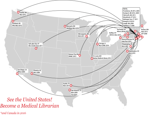
I discovered ZeeMaps thanks to a tweet by Melissa Rethlefsen. After I posted my “See the World as a Medical Librarian” map a few weeks back, she made her own map using this tool. I immediately bookmarked it.
Less for content than for the step-by-step guide to using Facebook’s Audience Insight tool for seeing trends, themes, etc. among Facebook users, I enjoyed Rob Leathern’s post on Medium entitled, Who is the Average Donald Trump Supporter?
And finally, because celebrating Christmas means, to me, repeating a number of time-worn rituals (I still get up at 5 AM on Christmas morning and run to the tree to see what Santa brought), I share Amy Dickinson’s story of Peanut Jesus, as she titles it, “My modern nativity story: Making Peanut Jesus.” I read it every holiday season. It’s hilarious and touching. I just love it.
P.S. I also read the chapter about the Christmas Pageant from John Irving’s, “A Prayer for Owen Meany.” Owen as Baby Jesus rising up out of that crib in the manger… I laugh until I cry.
Happy Holidays to you all! Thank you for following along with me another year.

