I was invited to give an 8-minute lightning talk at this evening’s SLA New England event in Boston called, Organizing Our Digital World. My topic is data visualization. Easy, right? Normally, yes, but in this case I have to give a talk on data visualization without the use of any visuals! I love a good challenge and this was just that. I mulled for weeks over how I might pull this off until it finally came to me, Schoolhouse Rock! Remember those? I loved them as a kid. I still know many by heart. And so I thought, if I can still remember conjunctions thanks to Conjunction Junction, maybe folks will be able to remember a few things about choosing the right chart for presenting data if I put the rules into a song.
Well, per my usual, my song became lengthy and wordy and without a good hook like, “Conjunction Junction, what’s your function…” but I still think it will work for tonight. Now I just need 2 minutes of fill to get to the 8-minute mark!
A huge credit for the basis of this song goes to Stephanie Evergreen. Her book, Effective Data Visualization, is a constant companion in my work and what I know of choosing the right charts, I learned from her books, tutorials, blog posts, and more. If you need some expert advice in this area, do seek her out.
So here’s the song (truly, a one-shot practice filmed in my studio last night). You’ll find the lyrics below. Feel free to sing along!
Data Viz: A Lesson in Verse
Sally Gore
I was spending time looking at some data
Figuring out the story it could tell.
Taking time studying the data
Lots of rows and columns in Excel.
I needed to get a report to my boss,
I needed to get it to her quick.
And though I wasn’t shooting for form over function
I still wanted to make it something slick.
I took a moment, pulled some books from my shelf.
Seeking out some expert advice.
Two books by Stephanie Evergreen,
I think they’re worth much more than their price.
I flipped to the page that talks about the science,
The work of Cleveland and McGill
Turns out that humans aren’t innate at reading data
And choosing the right charts takes some skill.
One of the books has a “Chart Chooser Cheat Sheet”
That I find an awful handy tool.
Plus a deck of “Chart Chooser” cards
Together they help me learn the rules.
So when I was invited to give this talk
Without the use of any picture cues
I thought I’d try and turn the rules into song
To quickly teach them all to you.
So here we go …
When you’ve got a single number
That you’re trying to convey
A single number of great importance,
The simple, single thing the numbers say.
The easiest means to get that thought across,
Is forget about charts of any kind,
Just write that number big and loud on the page
There’s no need to clutter people’s minds.
Other times you need to describe,
How two numbers are alike or not.
Bars side-by-side or back-to-back,
Try these or else a dot plot.
If you’ve got one group in particular
That changes while the others stay the same
Consider how a slopegraph can easily show
The difference that you’re trying to claim.
Many times you’ll find you’ve got a benchmark
And the story’s all about meeting goals.
Often times we measure performance
It’s important when we’re talking bankrolls.
A benchmark line across a line of columns
Will easily get the point across.
So will a bullet chart or indicator dots,
Pick and choose from these for the boss.
Now you know we LOVE to give surveys,
So what the survey says, we’ll need to show.
For this task there are lots of choices
Involving bars stacked up in a row.
Stacked or diverging, aggregated, too,
Or a bunch of small multiples across the top.
And if you get tired of plain old bars,
Show the same thing with a lollipop.
What about when there are parts of a whole,
Like a bunch of demographics of a group?
It’s easy to default to that famous old pie chart
But listen up folks, here’s the scoop.
Pie charts are old, pie charts are boring
But most they’re often difficult to read
Try a histogram, a tree map, a stacked bar instead
Or perhaps no visual is what you need.
Sometimes you’ve got some data that shows
How things changed over time.
It’s really pretty common, we see it quite a lot,
Did our numbers shrink or did they climb?
Well a few chart types that I sung about already
In this case will also do the trick
Think line graph, a slope graph, a dot plot, too,
Or a deviation bar’s a perfect pick.
Now you might be asking, “How about a scatterplot?”
I learned of those in Stats 101.”
And I must admit finding patterns in a scatter
Really can be a lot of fun.
A bunch of points plotted ‘cross an “X” and a “Y”
Show relationships between “A” and “B” –
When “A” does this, “B” does that,
And is there any trend that you can see?
Sometimes your data isn’t numbers at all,
But rather lots of words said or wrote.
Qualitative methods produce the kind of data,
Where the words give the meaning to take note.
Callouts are useful, heat maps can help,
Or you can make a cloud filled with words.
Each of these is handy, each of these works,
And your meaning won’t get lost on numbers nerds.
So that’s a few tips, I hope you find helpful
When you think about the story you can tell
As you’re sitting there staring at a spreadsheet of data
And all you really want to do is yell.
Start at step one, learn the different charts
And when and how and where they work best.
Once you’ve conquered that you just need to learn to make them
Step-by-step, you’ll have passed the test.
And no one will sit there staring at your PowerPoint slide or your report or your article wondering, “What the heck does this mean?!
 The following first appeared as an article for the Social Media column (edited by Lara Killian, AHIP) in MLA News, the monthly membership magazine of the Medical Library Association. Originally, I planned to simply repost it here without any additional thoughts or comments, but in the past 24 hours, a couple of things have occurred that make me wish to add just a quick note. First, I read the New York Times article,
 My story of creating visuals started on a Friday afternoon when I was staring at a spreadsheet/report that I’m frequently asked for in my work. It’s a tracking form of our clinical research scholars, telling the number of grants they’ve applied for, the number and percentage of said applications are funded, the amount of money associated with each, the number of publications they’ve written, and other such metrics that tell the UMCCTS their return on investment, if you will, for these researchers.
  As I was looking at it – and as it was a Friday afternoon and I was needing something fun to do to finish my work week – I wondered if I could draw a picture that told the same story that the numbers and information in this spreadsheet told. I like to draw, so I thought I’d give it a go. I wasn’t sure that my bosses would like it, but I figured it didn’t hurt to try.
 Surprisingly, my bosses loved it! And I was quickly asked to make some more, so I did.
  I made one to show how all five UMass campuses are involved with the UMCCTS. I made one highlighting the team science and/or collaborative nature of our sponsored programs. I made one showing the outcomes of our pilot awards, one illustrating the work of the Center for Microbiome Research, and one highlighting the peaks achieved by our Conquering Diseases Program. I covered my office door with them, put them in our monthly newsletter, and eventually we made
 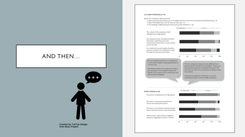 Next, we had our annual research retreat and when it came time for me to produce and give a report on the evaluations from the day, I decided to expand my chart-making skills, and learned how to make stacked horizontal bar charts to present the information more clearly and concisely. (Thank you,
  Of course, the more charts I made, the more folks came to me with requests to make more. Each was an opportunity to learn something new, to try something different, to make choices and decisions – some good, some bad, some better. I made slides for a presentation that our Quality Assurance leader was giving to a group of clinical research administrators.
 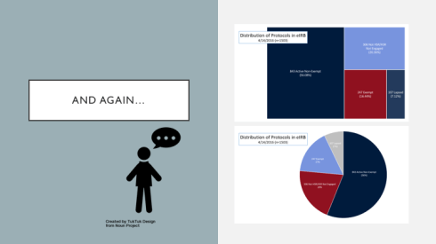 I made a tree map for the director of our Institutional Review Board. When I showed it to her she asked, “Where’s the pie?” So I made her a pie and she said, “You know, I like the tree better.” Yay! So did I.
 I also made her a 100% stacked bar chart to show average IRB approval times and in doing so, also finally made a color template of our UMCCTS colors. (Thank you,
  And then, taking Andy’s words to heart (before I even knew them) I read and learned and practiced and expanded my skill set, learning dot plots, split bar graphs, lollipop graphs, embedding labels, and creating both heat maps and bar graphs in R. (Thank you,
  And so when people continue to ask me why I’m no longer a librarian or what an evaluator does, I reply, that I AM a librarian. I’m a librarian who does evaluation and now that I’ve added the drawing pictures aspect to my toolkit, my wife calls me an INFORMATION ARTIST! It’s the best job title that I’ve ever had, by far.